The last few decades witnessed information technology reach its zenith; teach-savvy gadgets were introduced, multiple web and mobile apps launched that made lives easier. More people are buying Smart phones in stark contrast to notebooks; mobile Internet usage is predicted to surpass desktop internet usage by 2014. It is rational to believe that mobile search will overtake desktop search at some point of time in future.
In the era of smart phones, the developers realized the need of having a website that is mobile friendly that is where the notion of responsive design comes in.
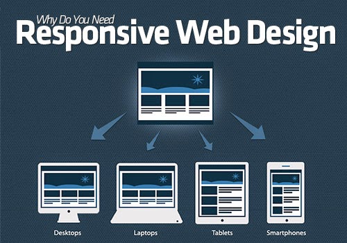
Not a lot of people are acquainted with the aforementioned term; Responsive web design is simply a website design that adjusts gracefully to fit on desktop, tablet, and Smartphone browsers.
The essence of a responsive website design is its functionality and user experience; other than that there exists a multitude of reasons responsive website design is going to work in your favor.
Cost Effective
Developing a responsive web design saves the hassle and the cost of developing a mobile version of the website, it would require spending a few hundred bucks in the interim but guarantees more profit in the long run. Other than the cost of development, a desktop and stand-alone mobile site calls for having different online marketing campaigns. Taking care of one campaign is feasible than managing two marketing strategies and two websites.
Gratifying User Experience
User friendly sites make the content interactive facilitating the users, enabling them to understand the content. They focus on enhanced user experience in terms of aesthetics- the web design. User experience being the focal point, Google is promoting the developers to open their eyes to the terrific thing responsive website development and design is. The most effective way to increase mobile traffic and to ensure seamless experience to the users lies in making use of responsive web development.
Bounce Rates
A responsive website displays the same content on multiple platforms keeping the users on page by providing them quality content; in contrast to the mobile version of websites where the content displayed is dissimilar from the desktop site leading to high bounce rates. Google will deduce this high bounce rate as a precursor that a website isn't offering relevant content to users, and that in turn would lead to decrease in the number of rankings.
Google Loves Responsive Websites
The energy of marketers is focused on pleasing Google Almighty so might as well do what needs to be done to impress Google. Since, Responsive website design is the ideal way to target audience as per Google. Mobile friendly sites are favored by Google because content using one URL is easier to manage for the responsive web developers and for users to share and interact with, in comparison to content on a separate mobile site.
Question are being raised debating whether a separate mobile website or a single, functional; responsive site is the best decision to make, but from an SEO perspective, the latter is usually a better option.
No comments:
Post a Comment